← Work

Home / App Pricing Page Projects

App Pricing Page Projects

Pricing page design projects for third-party Wix apps

2023 · Monetisation

The Wix App Market pricing infrastructure is the foundation for how developers monetize their apps. I owned the long-term UX evolution across multiple shipping cycles - introducing flexible billing models, transforming plan creation from a modal to a full page, redesigning the pricing comparison interface, and leading the platform-wide migration to Wix-managed free trials.


1. Wix-managed Free Trial

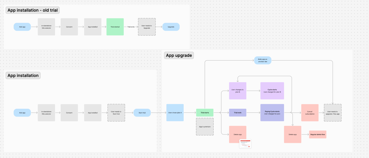
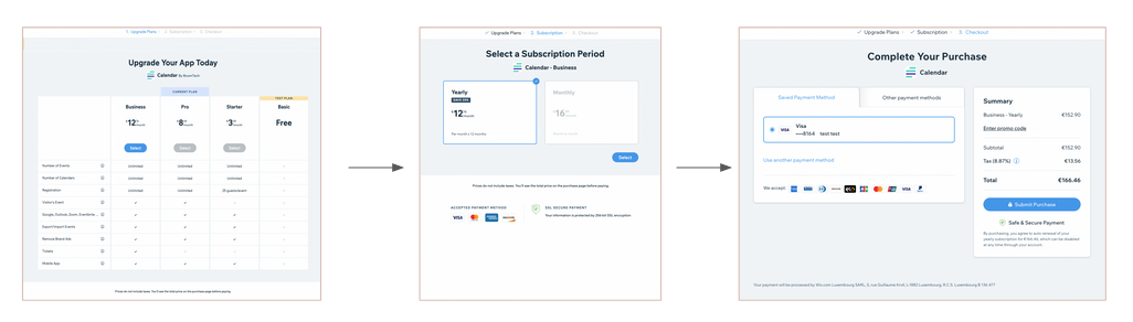
App developers on the Wix App Market had to implement free trials themselves. Checkout occurred only after the trial ended, resulting in notable conversion drop-off. I led the end-to-end UX for a new Wix-managed Free Trial: $0 upfront checkout with auto-billing at trial end. Scope covered the full journey: package picker, checkout, manage-apps states, email notifications, and a migration plan for apps already on self-managed trials. The result was strong trial-to-paid conversion and significant subscription growth in the first year.

Flow comparison showing the old self-managed trial logic (checkout after trial ends) vs. the new Wix-managed model ($0 checkout upfront with auto-billing at trial end)
Migration notice shown to developers already running self-managed trials, prompting them to switch to the new Wix-managed system
Confirmation modal for activating the new Wix-managed free trial — warns developers that changes only go live once the app is published

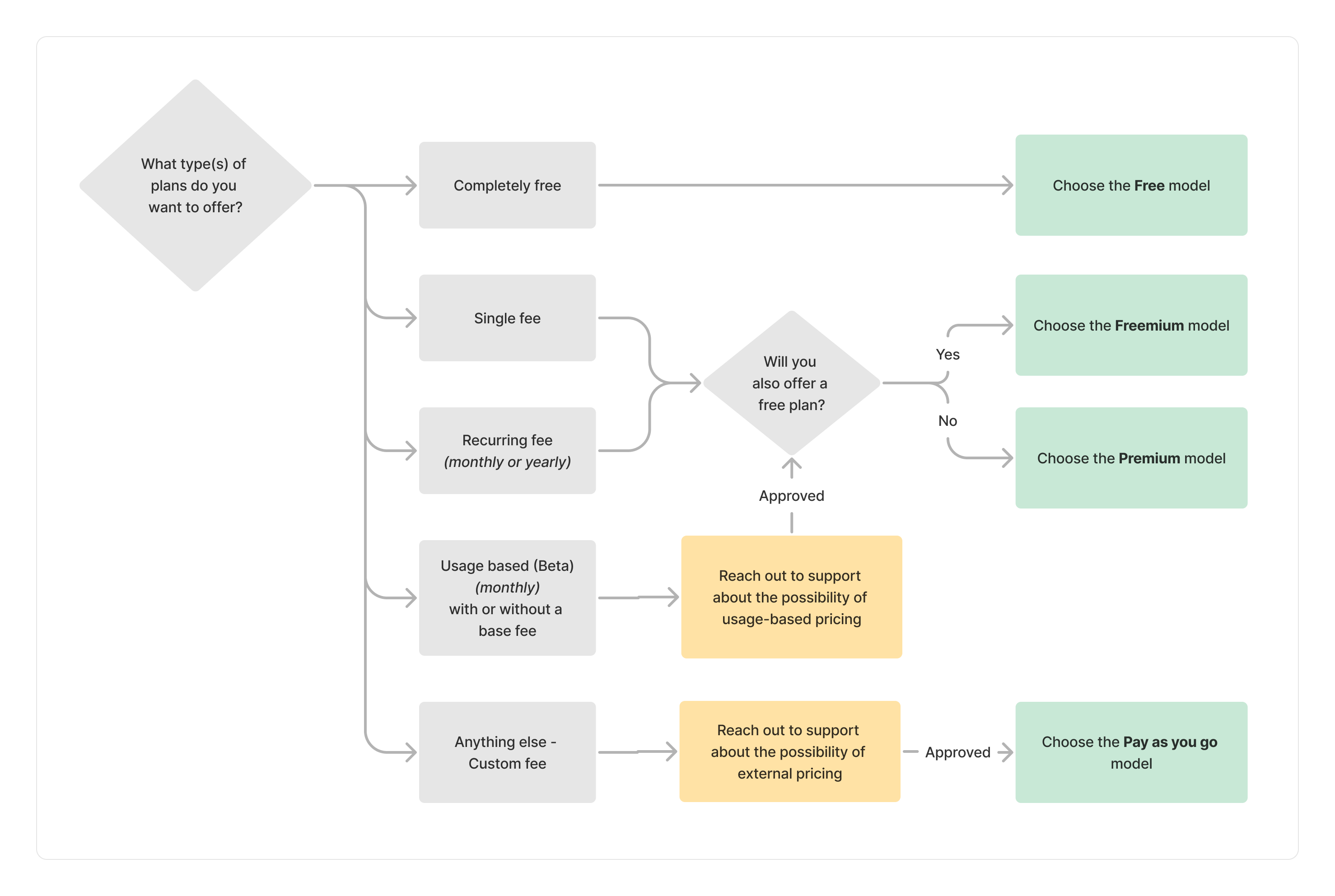
2. Adding Various Pricing Models (e.g., "Pay as You Go," "Metered Billing")

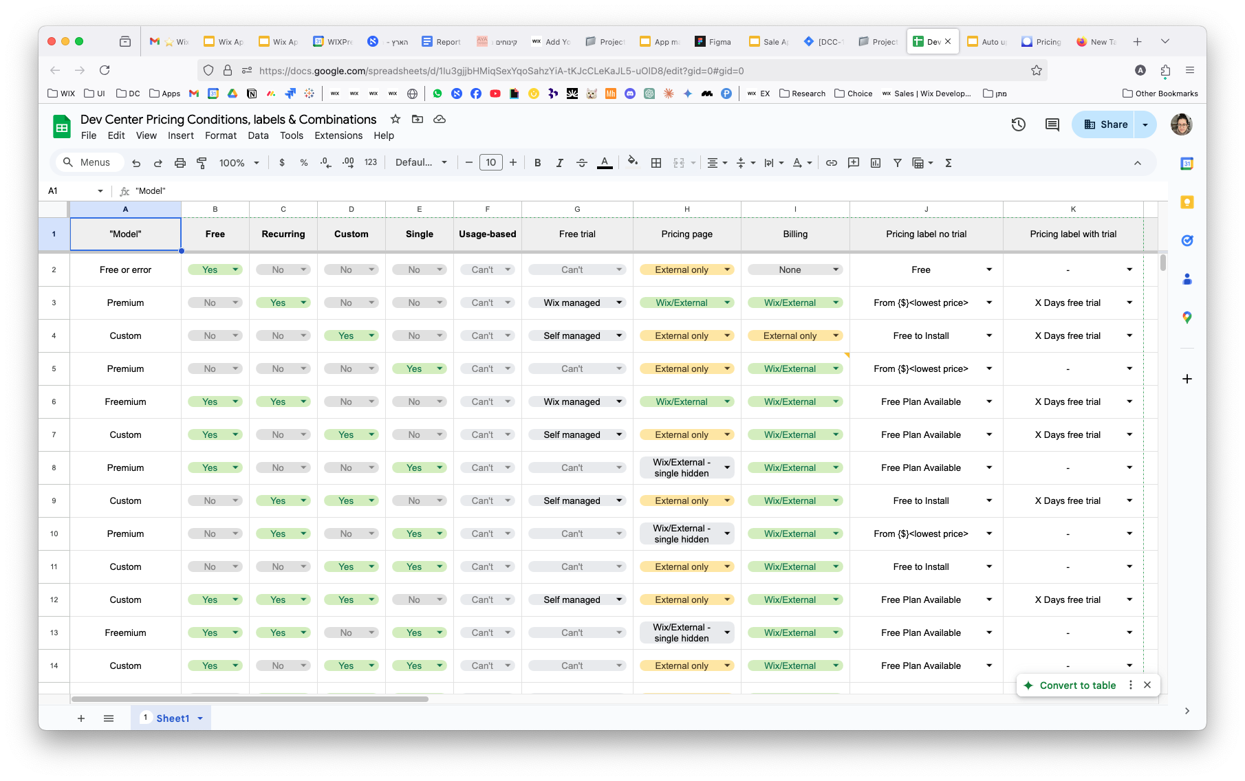
App developers were originally limited to fixed-price subscriptions - no usage-based models existed. I designed the UX for Pay-as-you-go and Metered Billing, tackling the challenge of helping developers identify the right model and configure valid plan combinations.

This produced a conditions matrix, a decision flowchart, and a business model selector, making the choice clear at a glance.

Conditions matrix mapping every valid combination of plan types, billing cycles, and pricing models
Decision flowchart guiding developers to the right pricing model based on their app's business structure
Business model selector - the entry point where developers choose their pricing structure before configuring plans
Add a plan page - user can choose to add the new usage-based plan

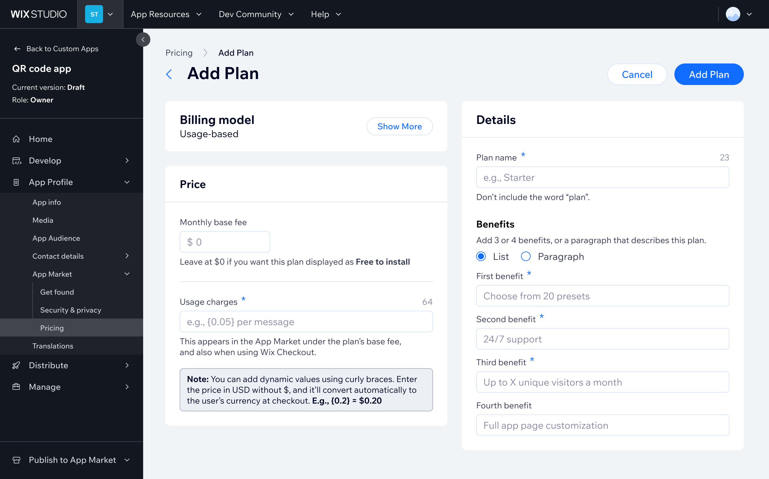
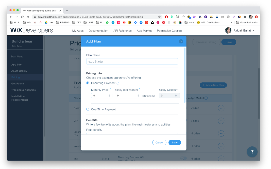
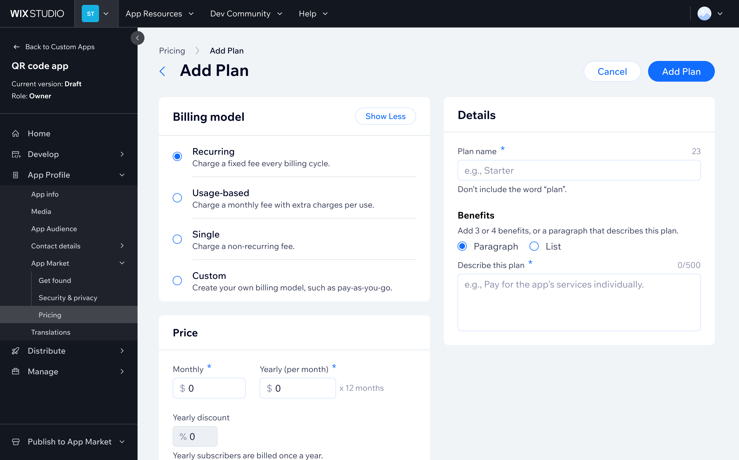
3. Revamping the “add a plan” page, which was a modal

The original "add a plan" experience was a compact modal - functional but constrained as plans grew more complex. I redesigned it as a dedicated full-page experience, giving each configuration step room to breathe and making the layout extensible for future features.

Before: The original plan creation modal - constrained layout with limited room for complex configurations
After: Redesigned as a full, scalable, dedicated page, giving each configuration field space and improving usability for complex plans

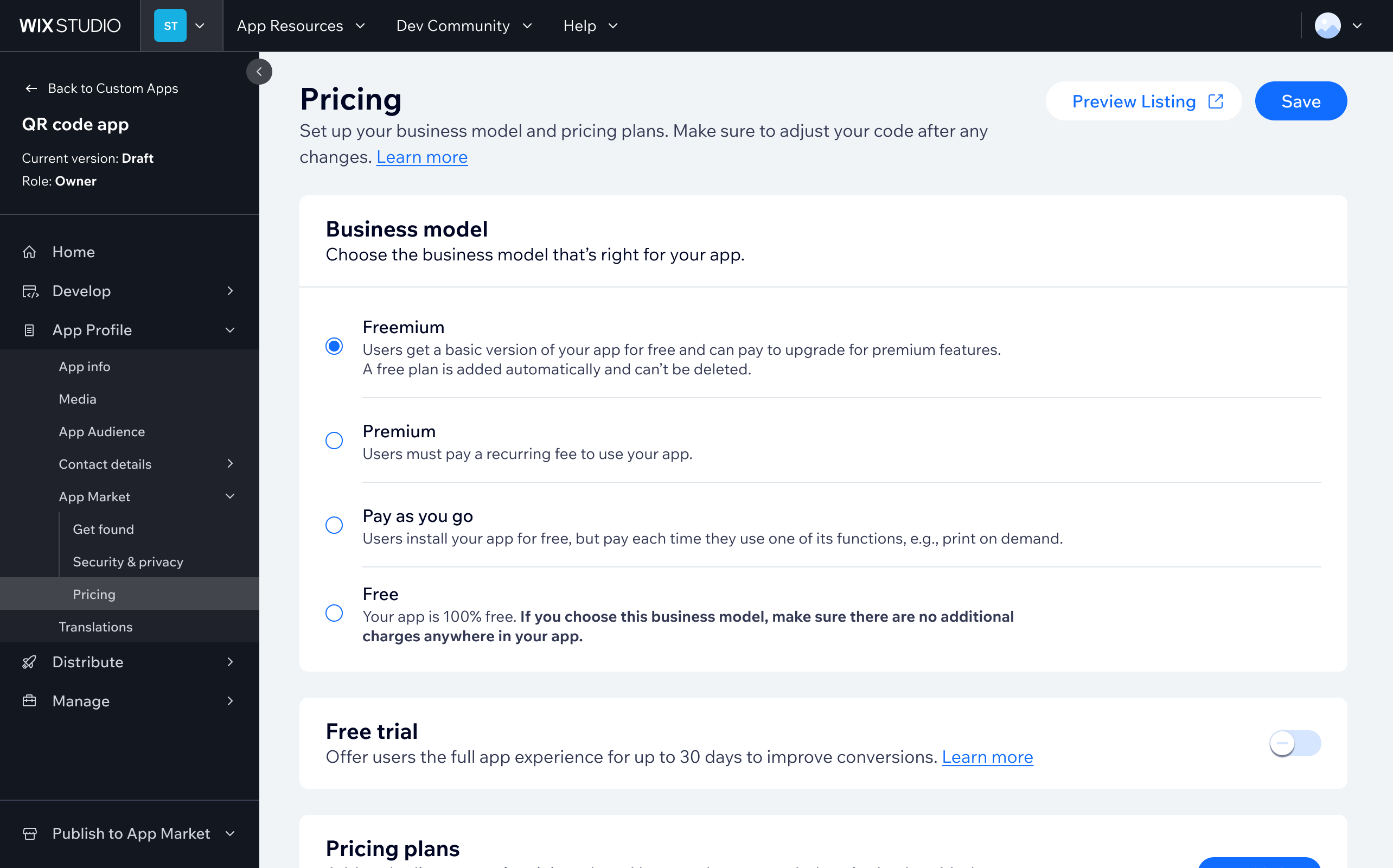
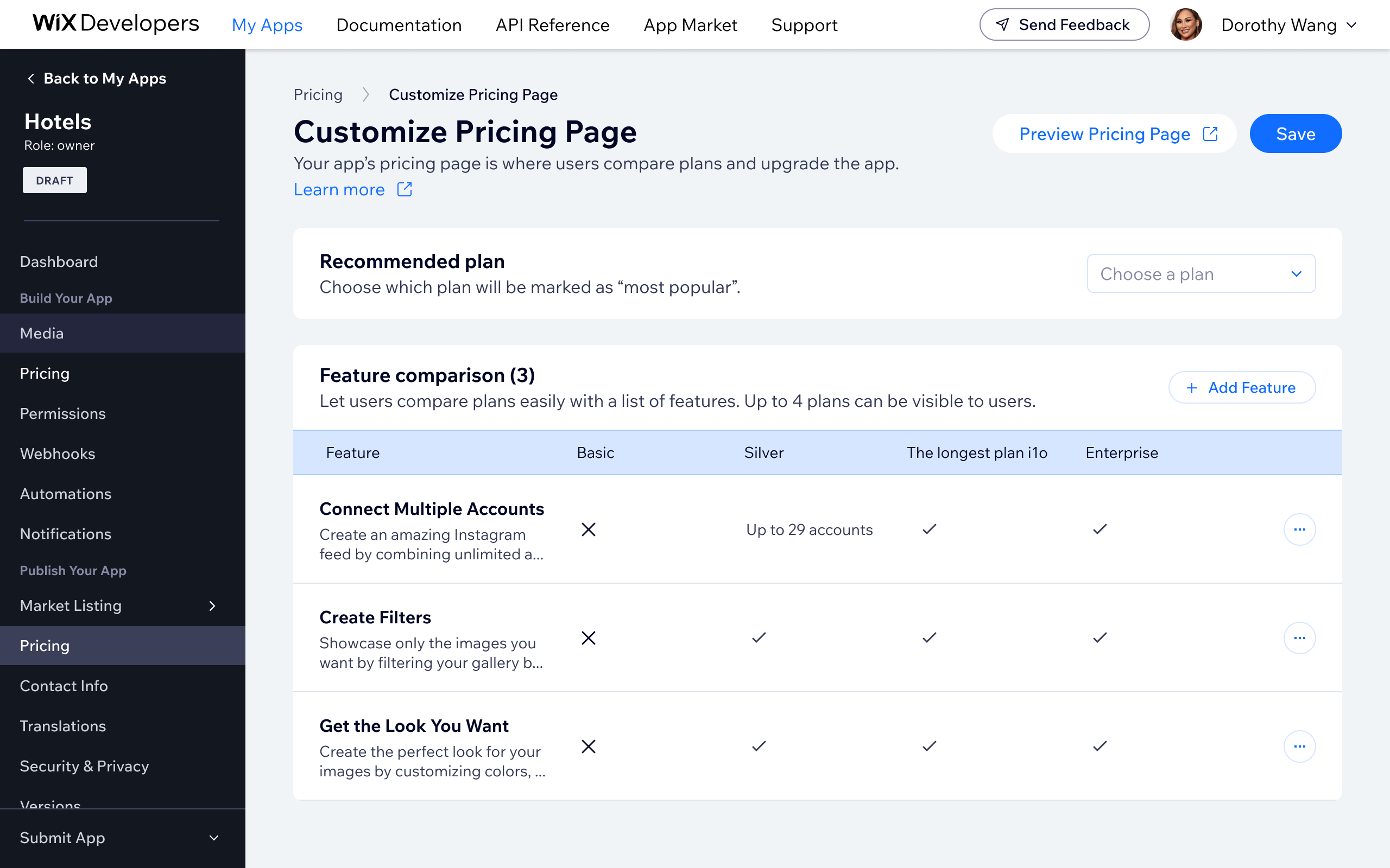
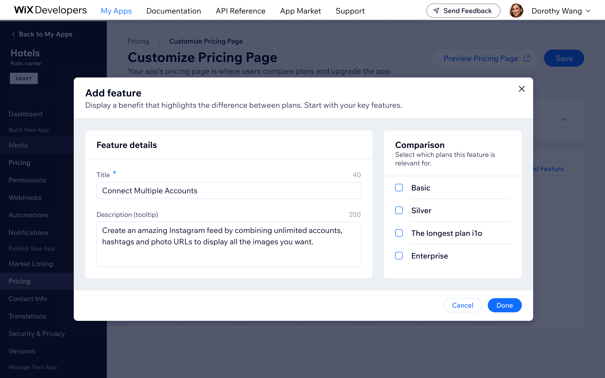
4. Revamping the Pricing Comparison Page

The pricing comparison page is the first thing users see when evaluating plans, so clarity and conversion matter. I redesigned it to improve plan differentiation, simplify the visual hierarchy, and give developers a customization surface to reflect their app's brand and structure.

Redesigned pricing comparison page - clearer plan hierarchy, improved scannability, and a customization surface for developers
Add feature' modal on the Customize Pricing Page — developers define a feature title and tooltip description, then select which plans it applies to, building out the plan comparison table

5. Downgrade plan

Wix App Market users had no way to downgrade their app plan - the only option was to cancel and repurchase, which drove unnecessary churn and pushed some developers away from using Wix’s billing system altogether. There was also a legal obligation to offer downgrade functionality. I designed the downgrade plan flow, addressing the core challenge of enabling users to move to a cheaper plan while still nudging them toward better-value options.

The solution allows users to select a lower-tier plan while showing a clear overview of what they’re changing to - maintaining transparency without removing the upgrade nudge. The design also extends to external pricing pages with Wix checkout integration. Success metrics targeted a decrease in premium cancellations and increased developer adoption of Wix’s native billing system. (Project is a WIP - final results pending.)

Previous state: only upgrade was available — users had no way to downgrade without cancelling and repurchasing
Proposed downgrade flow — mapping the full decision tree for moving to a lower-tier plan, including edge cases and nudge points
New entry point added to the Manage Apps page, surfacing the plan change option without disrupting the existing upgrade path
Plan selection screen allowing users to choose a lower-tier plan, with clear visibility of what they're changing to
Downgrade confirmation modal highlighting what the user will lose — nudging toward better-value plans while still allowing the downgrade to proceed

Bottom line

Owning a surface through multiple shipping cycles means you accumulate real opinions about what was done well the first time and what you would approach differently with hindsight. The free trial migration was the most satisfying part: a structural change to how checkout worked that had immediate, measurable impact on conversion.

More work